Warning: getimagesize(): SSL operation failed with code 1. OpenSSL Error messages: error:0A000086:SSL routines::certificate verify failed in /var/www/vhosts/spacedonkey.de/httpdocs/wp-content/plugins/print-pro-matic/print-pro-matic.php on line 261

Warning: getimagesize(): Failed to enable crypto in /var/www/vhosts/spacedonkey.de/httpdocs/wp-content/plugins/print-pro-matic/print-pro-matic.php on line 261

Warning: getimagesize(https://spacedonkey.de/wp-content/uploads/2021/10/printer-24.png): Failed to open stream: operation failed in /var/www/vhosts/spacedonkey.de/httpdocs/wp-content/plugins/print-pro-matic/print-pro-matic.php on line 261

Collapse-Pro-Matic Maptastic Resize Trigger

The maptastic class has two uses.

  1. The primary use is when a shortcode or other dynamically loaded element (such as a google map, for which the class is named) needs time and space to calculate it’s display size in the target.
  2. The secondary use is to initially ‘hide’ the targets off-page when many collapse elements are being used to prevent the ‘flickering’ effect where the hidden elements are displayed while the page loads, then are hidden once the javascript is finally triggered on document load.

In this post we focus on the primary use. To demonstrate this, we are going to add a google map in a collapse element without using the maptastic class. This is a standard google map embed direct form maps.google.com:

<iframe src="https://www.google.com/maps/embed?pb=!1m18!1m12!1m3!1d2370.176761299221!2d9.967689000000014!3d53.55461200000002!2m3!1f0!2f0!3f0!3m2!1i1024!2i768!4f13.1!3m3!1m2!1s0x47b18f6cbedab441%3A0x6678f70133d32916!2sMillerntor-Stadion!5e0!3m2!1sen!2s!4v1420013219192" width="800" height="600" frameborder="0" style="border:0"></iframe>
St. Pauli

That works fine, because the map has iframe has a specific width and height assigned.

Now we will assign a map using a google_maps shortcode and also assign the target a class of maptastic. maptastic is a class that is part of the collapse plugin:

.maptastic {
    position: absolute !important;
    left: -10000px !important;
    display:block !important;
    max-width: 9999px;
}

All together, the complete shortcode will look like this:
(this is the one we need to fix… it should work with just maptastic)

[expand title="St. Pauli" targclass="maptastic"][google_maps id="1875"][/expand]
St. Pauli
[google_maps id=”1875″]

See how the map is not the correct width? But once we resize the window it will then display correctly.

Now we are going to create a new class for our target that gives it a width of 100%

.mapclass {
   width: 100%;
}

and assign it to the target as well:

[expand title="St. Pauli" targclass="maptastic mapclass"][google_maps id="1875"][/expand]
St. Pauli
[google_maps id=”1875″]

This is the map without being placed in an expand element:

[[google_maps id="1875"]]
[google_maps id=”1875″]

This is w/o using maptastic and just using expand=”true”:

[expand title="St. Pauli" expanded="true"][google_maps id="1875"][/expand]
St. Pauli
[google_maps id=”1875″]

Everything is fine. OK… we need to tweak maptastic.

Collapse-Pro-Matic New Slide Effect: Toggle

This is a test of the new slide effect for that has been added to Collapse-Pro-Matic version 1.1.6.

For this to work on ALL expand elements, simply set the Animation Effect to Directional Slide in Collapse-Pro-Matic options page. To set only a single expand element using the shortcode, the animation_effect attribute set to ‘toggle’:

[expand title="Trigger" animation_effect="toggle" direction="left"]Target Content[/expand]
Trigger
Target Content

To best appreciate how this effect works, it would be best to create a target with a fixed width and height. Using the roll-your-own method the attributes are assigned using data-* format. Here is an example that wraps a fixed size target element in a slightly larger container:

<div class="collapseomatic" id="hortest" title="Trigger" data-animation-effect="toggle" data-direction="left">Trigger One</div>
<div style="width: 400px; height: 400px; border: 1px dotted #ccc;">
<div id="target-hortest" class="collapseomatic_content" style="width: 300px; Height: 300px; background: #ccc;">Target Content</div>
</div>
Trigger One
This is the target content div that is linked to the trigger one above. It is wrapped in a div so that there is no change to the vertical size of the page when it slides on and off.
Trigger Two
This example has no wrapping div, lets see what happens to the vertical scroll of the page when it slides on and off page.

Collapse-Pro-Mtic 1.1.6 includes three new attributes that override the global default settings, allowing single expand elements to have there own animation-effect, distance and direction attributes. Using the roll-your-own method they defined using the data-* attribute like so:

<div class="collapseomatic" id="hortesthree" title="Trigger" data-animation-effect="toggle" data-direction="right">Trigger Three</div>
Trigger Three
This example should slide in from the right
Trigger Four
This example should slide both… whatever that is

Collapse-O-Matic ImageMap Test

Anne asks: Is there a way to use this plugin with image maps?

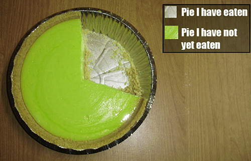
And by ‘this plugin’ she means Collapse-O-Matic. Well, Anne, that’s a good question! Let’s see what we can figure out here. First we need an image with an image map. We’ll pick something easy… like this:

pie_chart_500

Pie I have not yet eaten
The pie is a lie

Now clearly we will need to use the roll-your-own method to assign the triggers and target elements. So each of the image map area elements will need the collapseomatic class assigned. And since we do not want arrows assigned, we will also give each area element the class of noarrow.

<area id="noteaten" class="collapseomatic noarrow" shape="poly" coords="x, y, z, n" />

Now we just need to add in our target elements:

<div id="target-noteaten" class="collapseomatic_content ">Target Content</div>

Collapse Commander expand_trig & expand_targ Test

Standard Use of Collapse Commander’s expand_trig and expand_targ shortcodes:

This is the trigger
[expand_trig cid="1537"]

I’m a little donkey

This is the target:
[expand_targ cid="1537"]

short and stout
short and stout
Stuck in a manhole cover until someone pulled me out.

Note the above Collapse-Commander expand element had a default ID assigned. Currently, if a default ID has been assigned, the ID can-not be override with a shortcode attribute. This would not work:

[expand_trig cid="1537" id="donk"]
[expand_targ cid="1537" id="donk"]

Collapse-O-Matic Tabindex Test

This is a test of a new tabindex attribute feature. Assigning the tabindex attribute a numerical value will set the tabindex attribute for the trigger. We are going to use the number three, because we really like this number.

Now what this will do is assign a tabindex of three to the trigger so you should now be able to hit the tab button and eventually land on the trigger. Something to note:

In HTML5, the tabindex attribute can be used on any HTML element (it will validate on any HTML element. However, it is not necessarily useful).

In HTML 4.01, the tabindex attribute can be used with: <a>, <area>, <button>, <input>, <object>, <select> and <textarea>.

So, with that in mind:

HTML 4.01

[expand title="Trigger Text" tag="a" tabindex="3"]Target Content[/expand]
When this item is tabbed to, it will be clearly displayed as in-focus due to a nice little frame or border around the element.
Trigger Text

Target Content

HTML 5

[expand title="Trigger Text" tabindex="3"]Target Content[/expand]
Although this item has the same tabindex value as above, since it is using the default tag of DIV it will NOT be visibly shown as in-focus with a frame.

Trigger Text
Target Content

To display a visible change when our item is in focus, simply create a class for the trigger (using trigclass) and define the :focus pseudo class with an outline like so:

CSS
.lookatme:focus {
outline: #ccc dotted 2px;
}

[expand title="Trigger Text" tabindex="3" trigclass="lookatme"]Target Content[/expand]

Trigger Text
Target Content

Now here is a fun fact:
tabindex="0" allows the element to be placed in the default navigation order.
[expand title="Trigger Text" tabindex="0" trigclass="lookatme"]Target Content[/expand]

Trigger Text
Target Content

Collapse-O/Pro-Matic CSS Tricks – Arrows

Change Open Close Arrows

First create and upload two images. One image for the collapsed state, one for the expand state.
In this example we are using the following images:
Collapsed Icon Expanded Icon

Next we want to create a new class for these arrows. We are going to use the name greenballs. The class definitions need look like so:

CSS

.collapseomatic.greenballs {
background-image: url(full_url_to_collapsed_icon.png);
}
.colomat-close.greenballs {
background-image: url(full_url_to_expanded_icon.png);
}

Now we need to assign the trigclass attribute our value of ‘greenballs’

[expand title="Trigger Text" trigclass="greenballs"]Target Content[/expand]
This will produce the following:
collapse-o-matic_collapse_01 collapse-o-matic_expand_01

Now we need to adjust the padding so that the left side of the trigger text is not so smashed-up against the icons. To adjust the vertical centring we need to adjust background-position of the background url as well. Here is how the CSS will look after we make these changes:

CSS

.collapseomatic.greenballs {
background-image: url(full_url_to_collapsed_icon.png);
background-position: left center;
padding-left: 35px;
}

Looking much better now:

collapse-o-matic_collapse_02 collapse-o-matic_expand_02

Now If we have a list of expand elements, it might be nice to have a little border that separates each element. Also a bit more vertical padding between the elements:

CSS

.collapseomatic.greenballs {
background-image: url(https://spacedonkey.de/wp-content/uploads/2014/12/circle_plus.png);
background-position: left center;
padding-left: 35px;
padding-top: 15px;
border-bottom: 1px dotted #dfdfdf;
}

Almost complete:

collapse_list_03

All that is left to adjust is the spacing and add bottom border to the hidden content. Add a new class for and assign it using the targclass attribute:

[expand title="Trigger One" trigclass="greenballs" targclass="gb_target"]Target Content[/expand]

CSS

.gb_target{
padding: 15px;
border-bottom: 1px dotted #dfdfdf;
}

And the Final result:

Trigger One
Target Content

Trigger Two
Target Content

Trigger Three
Target Content